Hands on with the iPhone SE
Most of this is just on the spot thoughts and barely edited. Also, I apologise for the image quality, my Google Pixel isn’t the best at close photography
I’m at the apple store right now and while the iPhone 16 was cool, I was more interested in the iPhone SE since I had my iPhone 6 to compare it to.
General thoughts:

-
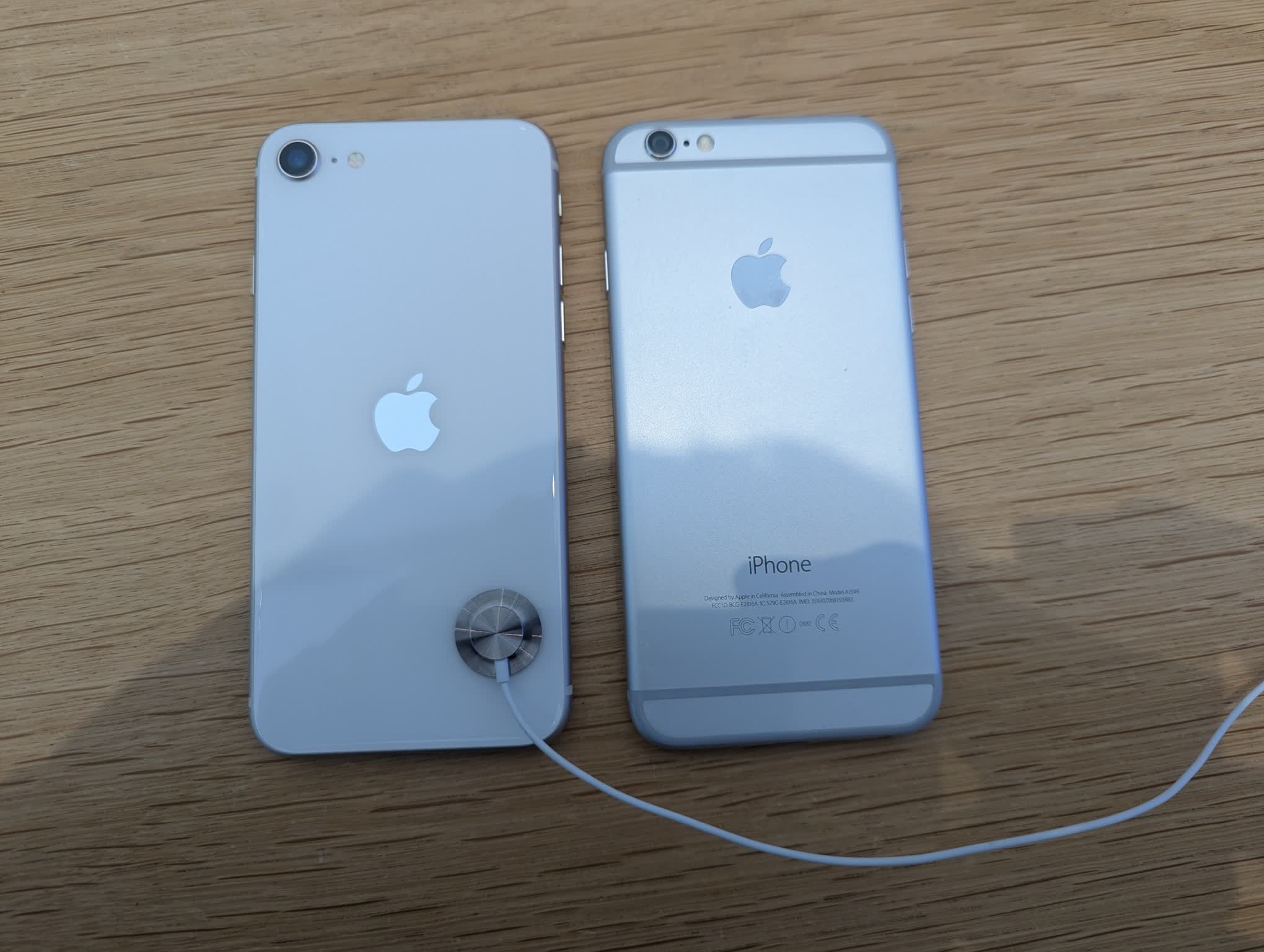
Both phones literally have the exact same chassis, owing to the fact that the iPhone SE is based on the iPhone 8, which was based on the 7, which was based on the 6. The only real difference is the fact the iPhone SE has a glass back, which I’m not sure how to feel about. Interestingly, the iPhone SE has a black front bezel even on light colours.
-
The second difference from the iPhone 6 is the lack of a real home button. I mean, it still exists, but it isn’t a physical button. Instead it’s a pressure sensitive area with haptics (thanks iPhone 7). I’m really disappointed with apple about this since the iPhone 6’s home button properly clicks. I prefer the iPhone 6 button even to the older button type on my iPad mini 2.
-
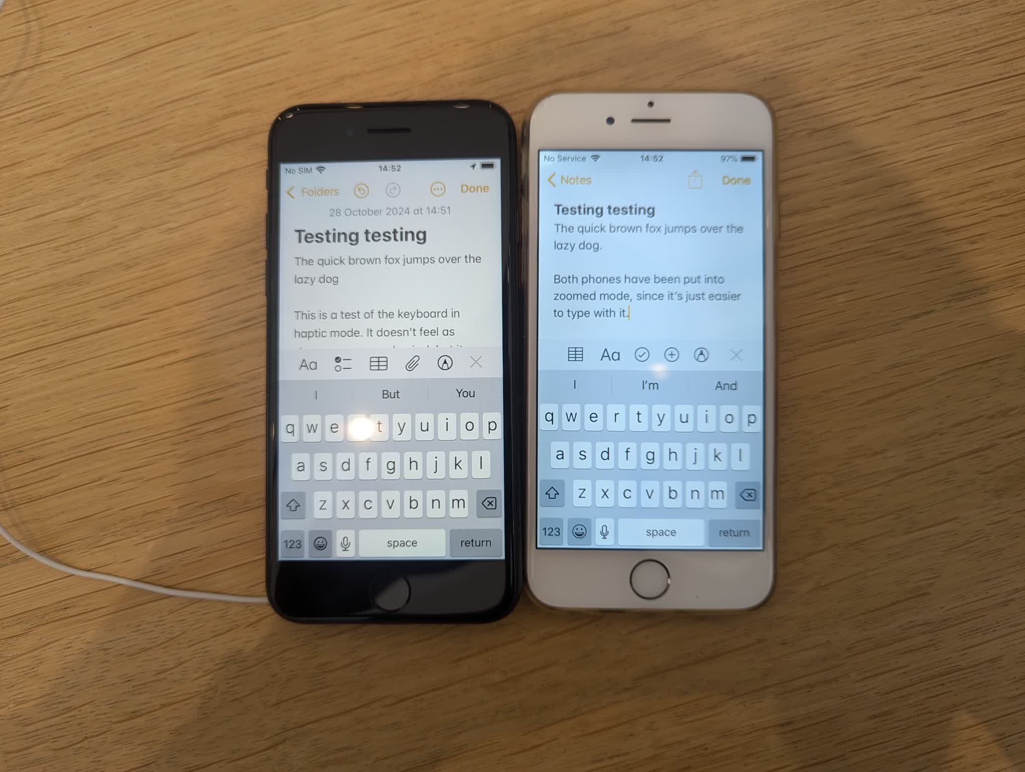
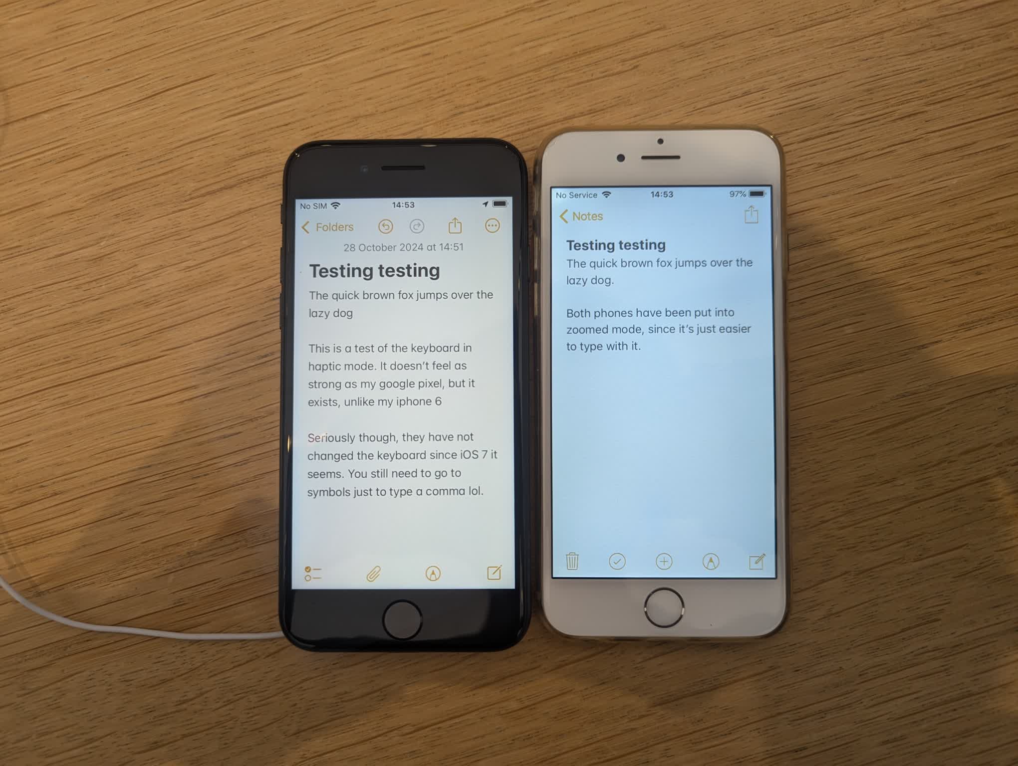
I was fairly excited for keyboard haptics since the Taptic Engine was only introduced on the iPhone 6s. However, on the demo unit, the setting was disabled by default, so I had to enable it myself. Unfortunately, the haptic strength was disappointing in comparison to my google pixel 7, and there doesn’t seem to be a way to adjust it. That’s just my preferences though.

-
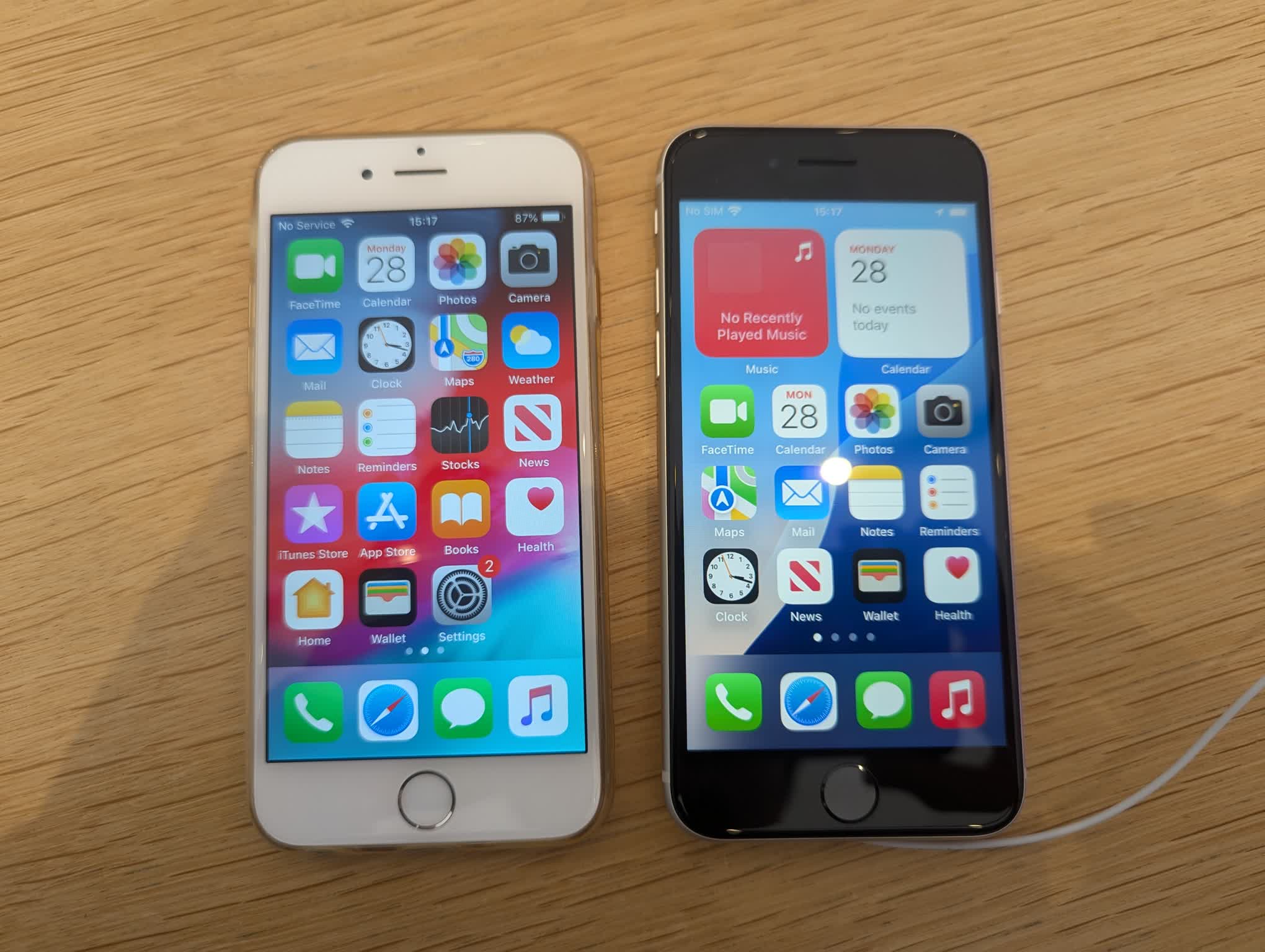
I’m really glad the kept zoomed display option, albeit under a different name now, since the screen is kinda small nowadays. The normal size isn’t so bad, just personal preference really. It’s interesting how they didn’t make an iPhone SE plus model, for people who still want a home button, but a larger screen. Then again, the whole point of the SE is the small form factor. If you do want a bigger screen, the iPhone 12 and 13 mini exist I guess. Shame apple isn’t making more of them.
-
The screen resolution feels the same as the iPhone 6, but since it’s a retina screen, there’s basically no need to increase the resolution if you can’t see the pixels at length anyways.

- The keyboard has remained the same from iOS 12 (and probably older). Same old annoying keyboard with no punctuation.

-
True Tone display is something I noticed, but I wouldn’t call it a significant feature or anything.
-
I was pleasantly surprised with the speakers now being landscape stereo, with the earpiece being the left speaker. The iPhone SE seems to be better than the iPhone 6 in terms of treble, but both seem equally as bad with bass. Then again, I was doing these tests at the apple store, so it was kinda noisy. The iPhone SE seemed to be louder than the iPhone 6 since the volume indication was lower for the same perceived loudness. At least it doesn’t peak out 90% of the time unlike the iPhone 6 I have.
-
I guess it makes sense that apple still uses the lightning port on the iPhone SE since it’s made for people who are used to the old style of phones, but I’d definitely like to see an iPhone SE with USB C.
-
A nice side effect of apple keeping the same dimensions for the iPhone SE is that cases made for the iPhone SE also work for older devices, like the iPhone 6. It even leaves a cutout on the bottom so you don’t have to worry about the headphone jack being blocked. The camera doesn’t align anymore though. The official apple case has a little lip on the edges to protect the corners and screen itself. It does kinda interfere with typing though, which I don’t like. Still, the cases are compatible enough that I could use one if needed, especially since iPhone 6 cases are practically gone now. I believe they’re fully compatible with iPhone 7 onwards.